In search of a tool to programmatically evaluate the personality of a neighborhood, our group began by focusing in on a pair determinants: Food and Rent. Realizing the sizable explanatory ability of these variables, we expanded our analysis to be more complete by controlling for and exploring both the density and diversity of restaurants. Finally, we conclude by segmenting the restaurants in case neighborhoods by price level and by diving a little more deeply into some cases. There is plenty more to it though, so read below for more!
Data Collection
The data for this project was gathered from multiple web sources and compiled into three final spreadsheets using the Python programming language. The scripts are located at the bottom; immediately below is a list of all of the raw datasets used for this project:
Case Studies
Part 1
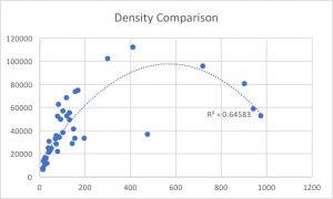
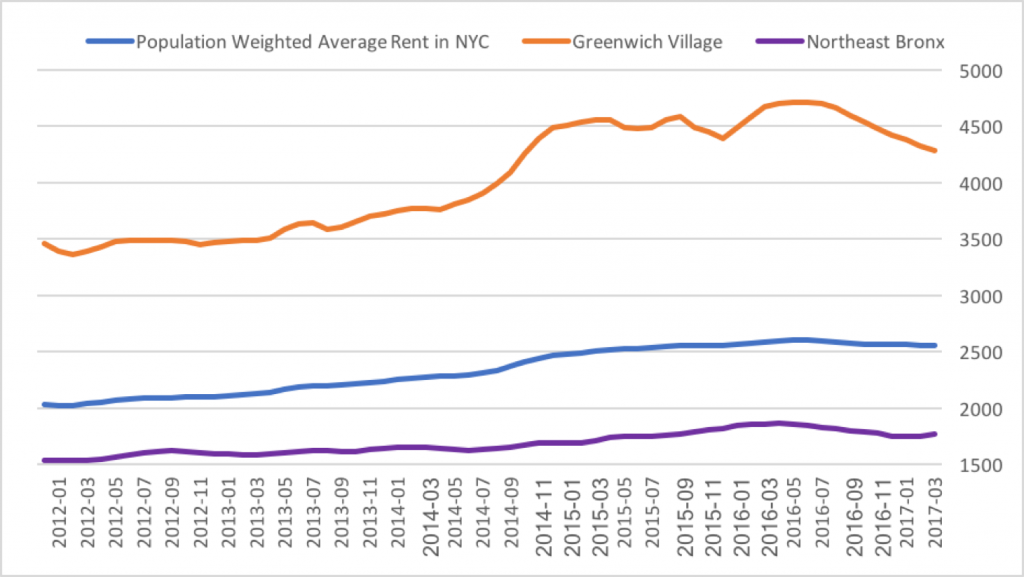
After realizing the trends in our data, a plan was developed to analyze the distribution of price tiers amongst neighborhoods. However, it quickly became clear that it was beyond our time constraints to crawl Yelp for every neighborhood, so a very high and very low option were chosen to create a comparison. As you can see in the image below, both of these data points were chosen because of the relative distance from the mean and relation to the trend. This chart, as mentioned earlier, measures rent on the X-axis and density on the Y-axis. The orange point, our high point, is Greenwich Village and Soho (one neighborhood). The purple point, our low point, is the Northeast Bronx. 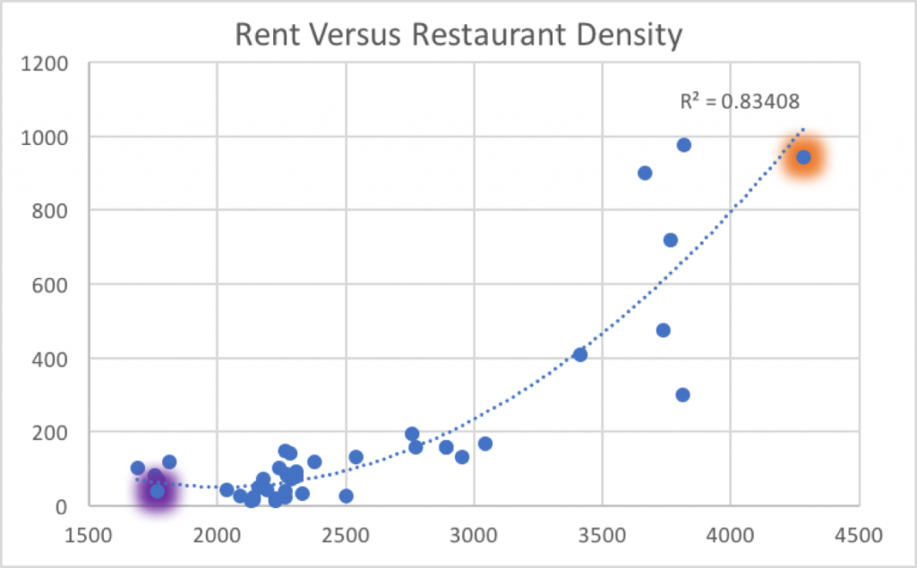
Part 2
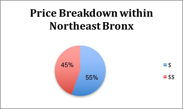
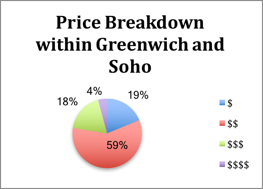
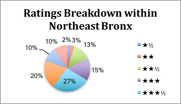
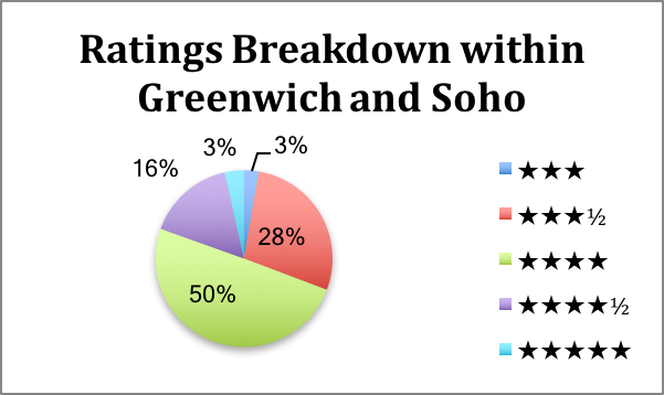
To take the analysis of the two case studies a step further, we decided to investigate the price tiers and ratings of restaurants in Greenwich Village/Soho and the Northeast Bronx. As mentioned earlier, this data was gathered from Yelp. Accordingly, it is important to note that the ultimate sources of the data are the individuals giving restaurant reviews, and filling out ratings and cost of their meal. Given the scope of our research and our limited resources, we do not investigate the demographics of people submitting reviews.
Rent versus Restaurant Density and Diversity
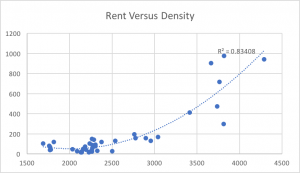
Once datasets had been created that were able to be manipulated and visualized in excel, relationships began to be explored, looking for correlations and explanatory power. The most striking relationship was found to be that between rent levels and restaurant density. As you can see in the first graph, the relationship between food options per square mile and median rent levels was explanatory with R²=83.4%. The X-axis marks the median rent level and the Y-axis the density.